الگوریتم فازی C-Means در پایتون — راهنمای کاربردی
از اصول «منطق فازی» (Fuzzy Logic)، میتوان برای خوشهبندی دادههای چندبُعدی استفاده کرد. با استفاده از منطق فازی در دادهکاوی، به هر نمونه داده یک «عضویت» (Membership) برای هر «مرکز خوشه» (Cluster Center) تخصیص داده میشود که مقداری بین ۰ الی ۱۰۰ درصد دارد. این روش میتواند نسبت به خوشهبندیهای دارای «آستانه سخت» (Hard-Thresholded) سنتی که در آن هر نمونه یک برچسب مشخص دارد بسیار قدرتمندتر واقع شود. خوشهبندی با الگوریتم فازی C-Means که به آن فازی K-Means نیز گفته میشود، در پایتون با بهرهگیری از تابع skfuzzy.cmeans انجام میشود. خروجی این تابع میتواند برای دستهبندی دادههای جدید، مطابق با خوشههای محاسبه شده (که به آنها پیشبینی نیز گفته میشود)، با بهرهگیری از skfuzzy.cmeans_predict هدفگذاری مجدد شود و در واقع قابل استفاده برای دادههای جدید باشد.
تولید داده و راهاندازی
در این مثال، ابتدا ورودیهای لازم دریافت و سپس، «دادههای آزمون» (Test Data) برای کار تعریف میشوند.
1from __future__ import division, print_function
2import numpy as np
3import matplotlib.pyplot as plt
4import skfuzzy as fuzz
5
6colors = ['b', 'orange', 'g', 'r', 'c', 'm', 'y', 'k', 'Brown', 'ForestGreen']
7
8# Define three cluster centers
9centers = [[4, 2],
10 [1, 7],
11 [5, 6]]
12
13# Define three cluster sigmas in x and y, respectively
14sigmas = [[0.8, 0.3],
15 [0.3, 0.5],
16 [1.1, 0.7]]
17
18# Generate test data
19np.random.seed(42) # Set seed for reproducibility
20xpts = np.zeros(1)
21ypts = np.zeros(1)
22labels = np.zeros(1)
23for i, ((xmu, ymu), (xsigma, ysigma)) in enumerate(zip(centers, sigmas)):
24 xpts = np.hstack((xpts, np.random.standard_normal(200) * xsigma + xmu))
25 ypts = np.hstack((ypts, np.random.standard_normal(200) * ysigma + ymu))
26 labels = np.hstack((labels, np.ones(200) * i))
27
28# Visualize the test data
29fig0, ax0 = plt.subplots()
30for label in range(3):
31 ax0.plot(xpts[labels == label], ypts[labels == label], '.',
32 color=colors[label])
33ax0.set_title('Test data: 200 points x3 clusters.')
الگوریتم فازی C-Means برای خوشهبندی
در بالا، دادههای تست مشاهده میشوند. به طور مشخص، سه ناحیه متمایز از هم وجود دارند. اما، اگر مشخص نباشد که چه تعداد خوشه باید وجود داشته باشد چه اقدامی باید انجام داد؟ اگر دادهها خیلی شفاف خوشهبندی نشوند (مرزهای دستهها مشخص نباشد) چه کار باید کرد؟
در ادامه، خوشهبندی چندین بار با تعداد خوشههای بین ۲ و ۹ تکرار میشود.
1# Set up the loop and plot
2fig1, axes1 = plt.subplots(3, 3, figsize=(8, 8))
3alldata = np.vstack((xpts, ypts))
4fpcs = []
5
6for ncenters, ax in enumerate(axes1.reshape(-1), 2):
7 cntr, u, u0, d, jm, p, fpc = fuzz.cluster.cmeans(
8 alldata, ncenters, 2, error=0.005, maxiter=1000, init=None)
9
10 # Store fpc values for later
11 fpcs.append(fpc)
12
13 # Plot assigned clusters, for each data point in training set
14 cluster_membership = np.argmax(u, axis=0)
15 for j in range(ncenters):
16 ax.plot(xpts[cluster_membership == j],
17 ypts[cluster_membership == j], '.', color=colors[j])
18
19 # Mark the center of each fuzzy cluster
20 for pt in cntr:
21 ax.plot(pt[0], pt[1], 'rs')
22
23 ax.set_title('Centers = {0}; FPC = {1:.2f}'.format(ncenters, fpc))
24 ax.axis('off')
25
26fig1.tight_layout()
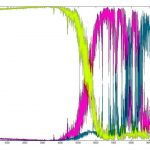
ضریب تقسیم فازی (FPC)
«ضریب تقسیم فازی» (Fuzzy Partition Coefficient)، در طیفی بین 0 و ۱ قرار میگیرد که در آن ۱ بهترین است. این سنجه به کاربر میگوید که دادهها به وسیله یک مدل چقدر شفاف توصیف شدهاند. سپس، مجموعه دادهها چندین بار با تعداد خوشههای بین ۲ تا ۹ خوشهبندی میشوند (در اینجا این آگاهی از پیش وجود داشت که تعداد خوشهها سه تا است). سپس، نتایج خوشهبندی نمایش داده میشود و نمودار ضریب تقسیم فازی رسم میشود.
هنگامی که مقدار FPC بیشینه شد، دادهها به بهترین شکل توصیف میشوند.
1fig2, ax2 = plt.subplots()
2ax2.plot(np.r_[2:11], fpcs)
3ax2.set_xlabel("Number of centers")
4ax2.set_ylabel("Fuzzy partition coefficient")
همانطور که مشهود است، تعداد ایدهآل مرکزها برابر با ۳ است. در این مثال کشف این موضوع خبر جدیدی نبود چون همانطور که پیشتر بیان شد، از قبل این آگاهی وجود داشت که تعداد خوشهها سه تا است. اما در حالت کلی، استفاده از FPC هنگامی که ساختار دادهها شفاف نیست، بسیار مفید محسوب میشود. توجه به این نکته لازم است که کار با دو مرکز خوشه آغاز میشود. خوشهبندی مجموعه داده با تنها یک مرکز خوشه یک راهکار بدیهی است و بر اساس تعریف FPC == 1 را باز میگرداند (در واقع تنها یک خوشه وجود دارد که همه دادهها به آن تعلق دارند).
دستهبندی دادههای جدید
اکنون که میتوان دادهها را خوشهبندی کرد، گام بعدی معمولا برازش نمونه دادههای جدید در مدل موجود است. به این کار پیشبینی گفته میشود و به مدل موجود و دادههای جدید برای دستهبندی نیاز دارد. برای دستهبندی دادههای جدید، نیاز به مدل موجود و دادههای جدید برای انجام دستهبندی است.
ساخت مدل
همانطور که پیشتر بیان شد، بهترین مدل دارای سه خوشه خروجی است. در ادامه، مدل سه خوشهای برای استفاده به منظور انجام خوشهبندی مجددا ساخته میشود، دادههای یونیفرم جدید تولید میشوند و پیشبینی میشود که هر نمونه داده جدید به کدام خوشه تعلق دارد.
1# Regenerate fuzzy model with 3 cluster centers - note that center ordering
2# is random in this clustering algorithm, so the centers may change places
3cntr, u_orig, _, _, _, _, _ = fuzz.cluster.cmeans(
4 alldata, 3, 2, error=0.005, maxiter=1000)
5
6# Show 3-cluster model
7fig2, ax2 = plt.subplots()
8ax2.set_title('Trained model')
9for j in range(3):
10 ax2.plot(alldata[0, u_orig.argmax(axis=0) == j],
11 alldata[1, u_orig.argmax(axis=0) == j], 'o',
12 label='series ' + str(j))
13ax2.legend()
پیشبینی
در نهایت، دادههایی که به صورت یکنواخت نمونهبرداری شدهاند تولید میشوند و خوشهبندی آنها با بهرهگیری از cmeans_predict انجام میشود. cmeans_predict در واقع آن را در یک مدل از پیش موجود ترکیب میکند.
1# Generate uniformly sampled data spread across the range [0, 10] in x and y
2newdata = np.random.uniform(0, 1, (1100, 2)) * 10
3
4# Predict new cluster membership with `cmeans_predict` as well as
5# `cntr` from the 3-cluster model
6u, u0, d, jm, p, fpc = fuzz.cluster.cmeans_predict(
7 newdata.T, cntr, 2, error=0.005, maxiter=1000)
8
9# Plot the classified uniform data. Note for visualization the maximum
10# membership value has been taken at each point (i.e. these are hardened,
11# not fuzzy results visualized) but the full fuzzy result is the output
12# from cmeans_predict.
13cluster_membership = np.argmax(u, axis=0) # Hardening for visualization
14
15fig3, ax3 = plt.subplots()
16ax3.set_title('Random points classifed according to known centers')
17for j in range(3):
18 ax3.plot(newdata[cluster_membership == j, 0],
19 newdata[cluster_membership == j, 1], 'o',
20 label='series ' + str(j))
21ax3.legend()
22
23plt.show()
کد کامل این کار را میتوان از زیر کپی و در فایل با فرمت py. ذخیرهسازی کرد.
1"""
2========================
3Fuzzy c-means clustering
4========================
5
6Fuzzy logic principles can be used to cluster multidimensional data, assigning
7each point a *membership* in each cluster center from 0 to 100 percent. This
8can be very powerful compared to traditional hard-thresholded clustering where
9every point is assigned a crisp, exact label.
10
11Fuzzy c-means clustering is accomplished via ``skfuzzy.cmeans``, and the
12output from this function can be repurposed to classify new data according to
13the calculated clusters (also known as *prediction*) via
14``skfuzzy.cmeans_predict``
15
16Data generation and setup
17-------------------------
18
19In this example we will first undertake necessary imports, then define some
20test data to work with.
21
22"""
23from __future__ import division, print_function
24import numpy as np
25import matplotlib.pyplot as plt
26import skfuzzy as fuzz
27
28colors = ['b', 'orange', 'g', 'r', 'c', 'm', 'y', 'k', 'Brown', 'ForestGreen']
29
30# Define three cluster centers
31centers = [[4, 2],
32 [1, 7],
33 [5, 6]]
34
35# Define three cluster sigmas in x and y, respectively
36sigmas = [[0.8, 0.3],
37 [0.3, 0.5],
38 [1.1, 0.7]]
39
40# Generate test data
41np.random.seed(42) # Set seed for reproducibility
42xpts = np.zeros(1)
43ypts = np.zeros(1)
44labels = np.zeros(1)
45for i, ((xmu, ymu), (xsigma, ysigma)) in enumerate(zip(centers, sigmas)):
46 xpts = np.hstack((xpts, np.random.standard_normal(200) * xsigma + xmu))
47 ypts = np.hstack((ypts, np.random.standard_normal(200) * ysigma + ymu))
48 labels = np.hstack((labels, np.ones(200) * i))
49
50# Visualize the test data
51fig0, ax0 = plt.subplots()
52for label in range(3):
53 ax0.plot(xpts[labels == label], ypts[labels == label], '.',
54 color=colors[label])
55ax0.set_title('Test data: 200 points x3 clusters.')
56
57"""
58.. image:: PLOT2RST.current_figure
59
60Clustering
61----------
62
63Above is our test data. We see three distinct blobs. However, what would happen
64if we didn't know how many clusters we should expect? Perhaps if the data were
65not so clearly clustered?
66
67Let's try clustering our data several times, with between 2 and 9 clusters.
68
69"""
70# Set up the loop and plot
71fig1, axes1 = plt.subplots(3, 3, figsize=(8, 8))
72alldata = np.vstack((xpts, ypts))
73fpcs = []
74
75for ncenters, ax in enumerate(axes1.reshape(-1), 2):
76 cntr, u, u0, d, jm, p, fpc = fuzz.cluster.cmeans(
77 alldata, ncenters, 2, error=0.005, maxiter=1000, init=None)
78
79 # Store fpc values for later
80 fpcs.append(fpc)
81
82 # Plot assigned clusters, for each data point in training set
83 cluster_membership = np.argmax(u, axis=0)
84 for j in range(ncenters):
85 ax.plot(xpts[cluster_membership == j],
86 ypts[cluster_membership == j], '.', color=colors[j])
87
88 # Mark the center of each fuzzy cluster
89 for pt in cntr:
90 ax.plot(pt[0], pt[1], 'rs')
91
92 ax.set_title('Centers = {0}; FPC = {1:.2f}'.format(ncenters, fpc))
93 ax.axis('off')
94
95fig1.tight_layout()
96
97"""
98.. image:: PLOT2RST.current_figure
99
100The fuzzy partition coefficient (FPC)
101-------------------------------------
102
103The FPC is defined on the range from 0 to 1, with 1 being best. It is a metric
104which tells us how cleanly our data is described by a certain model. Next we
105will cluster our set of data - which we know has three clusters - several
106times, with between 2 and 9 clusters. We will then show the results of the
107clustering, and plot the fuzzy partition coefficient. When the FPC is
108maximized, our data is described best.
109
110"""
111
112fig2, ax2 = plt.subplots()
113ax2.plot(np.r_[2:11], fpcs)
114ax2.set_xlabel("Number of centers")
115ax2.set_ylabel("Fuzzy partition coefficient")
116
117"""
118.. image:: PLOT2RST.current_figure
119
120As we can see, the ideal number of centers is 3. This isn't news for our
121contrived example, but having the FPC available can be very useful when the
122structure of your data is unclear.
123
124Note that we started with *two* centers, not one; clustering a dataset with
125only one cluster center is the trivial solution and will by definition return
126FPC == 1.
127
128
129====================
130Classifying New Data
131====================
132
133Now that we can cluster data, the next step is often fitting new points into
134an existing model. This is known as prediction. It requires both an existing
135model and new data to be classified.
136
137Building the model
138------------------
139
140We know our best model has three cluster centers. We'll rebuild a 3-cluster
141model for use in prediction, generate new uniform data, and predict which
142cluster to which each new data point belongs.
143
144"""
145# Regenerate fuzzy model with 3 cluster centers - note that center ordering
146# is random in this clustering algorithm, so the centers may change places
147cntr, u_orig, _, _, _, _, _ = fuzz.cluster.cmeans(
148 alldata, 3, 2, error=0.005, maxiter=1000)
149
150# Show 3-cluster model
151fig2, ax2 = plt.subplots()
152ax2.set_title('Trained model')
153for j in range(3):
154 ax2.plot(alldata[0, u_orig.argmax(axis=0) == j],
155 alldata[1, u_orig.argmax(axis=0) == j], 'o',
156 label='series ' + str(j))
157ax2.legend()
158
159"""
160.. image:: PLOT2RST.current_figure
161
162Prediction
163----------
164
165Finally, we generate uniformly sampled data over this field and classify it
166via ``cmeans_predict``, incorporating it into the pre-existing model.
167
168"""
169
170# Generate uniformly sampled data spread across the range [0, 10] in x and y
171newdata = np.random.uniform(0, 1, (1100, 2)) * 10
172
173# Predict new cluster membership with `cmeans_predict` as well as
174# `cntr` from the 3-cluster model
175u, u0, d, jm, p, fpc = fuzz.cluster.cmeans_predict(
176 newdata.T, cntr, 2, error=0.005, maxiter=1000)
177
178# Plot the classified uniform data. Note for visualization the maximum
179# membership value has been taken at each point (i.e. these are hardened,
180# not fuzzy results visualized) but the full fuzzy result is the output
181# from cmeans_predict.
182cluster_membership = np.argmax(u, axis=0) # Hardening for visualization
183
184fig3, ax3 = plt.subplots()
185ax3.set_title('Random points classifed according to known centers')
186for j in range(3):
187 ax3.plot(newdata[cluster_membership == j, 0],
188 newdata[cluster_membership == j, 1], 'o',
189 label='series ' + str(j))
190ax3.legend()
191
192plt.show()
193
194"""
195.. image:: PLOT2RST.current_figure
196
197"""
اگر نوشته بالا برای شما مفید بوده، آموزشهای زیر نیز به شما پیشنهاد میشوند:
- مجموعه آموزشهای آمار، احتمالات و دادهکاوی
- آموزش طراحی سیستمهای فازی عصبی یا ANFIS با استفاده از الگوریتمهای فرا ابتکاری و تکاملی
- مجموعه آموزشهای سیستمها و منطق فازی
- داده کاوی (Data Mining) — از صفر تا صد
- داده کاوی فازی چیست؟ — به زبان ساده
- یادگیری علم داده (Data Science) با پایتون — از صفر تا صد
^^